Locality: 2225 Üllő, Hungary
Client: private
Area: 114 m²
Year: 2017-2019
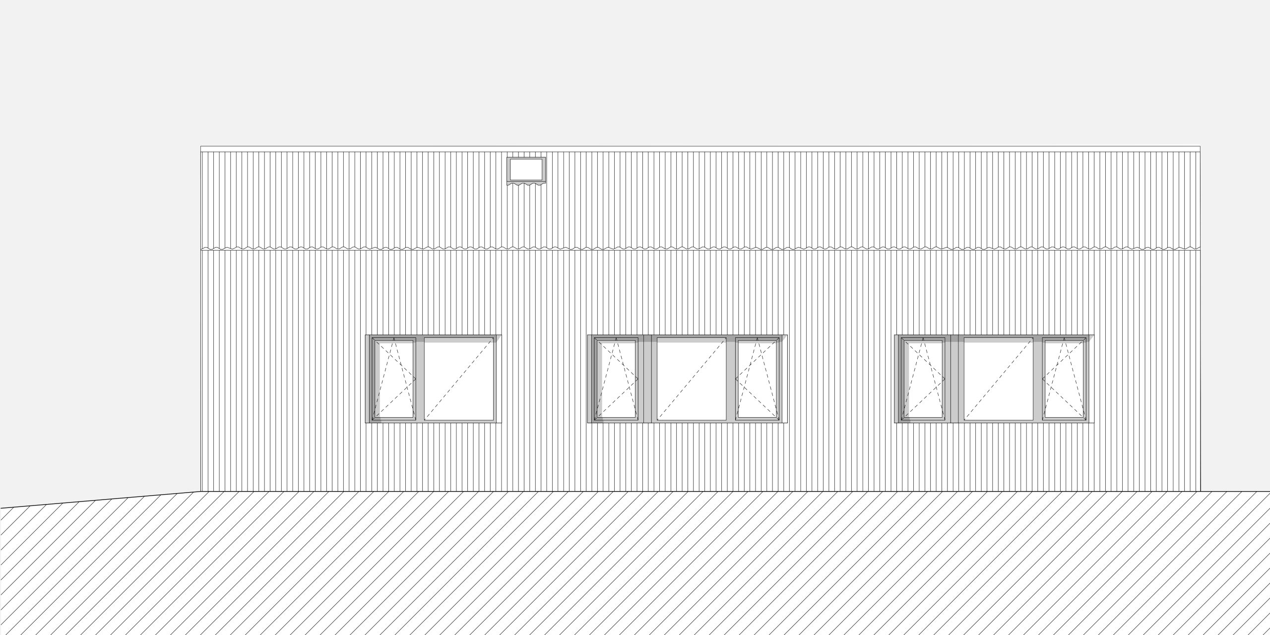
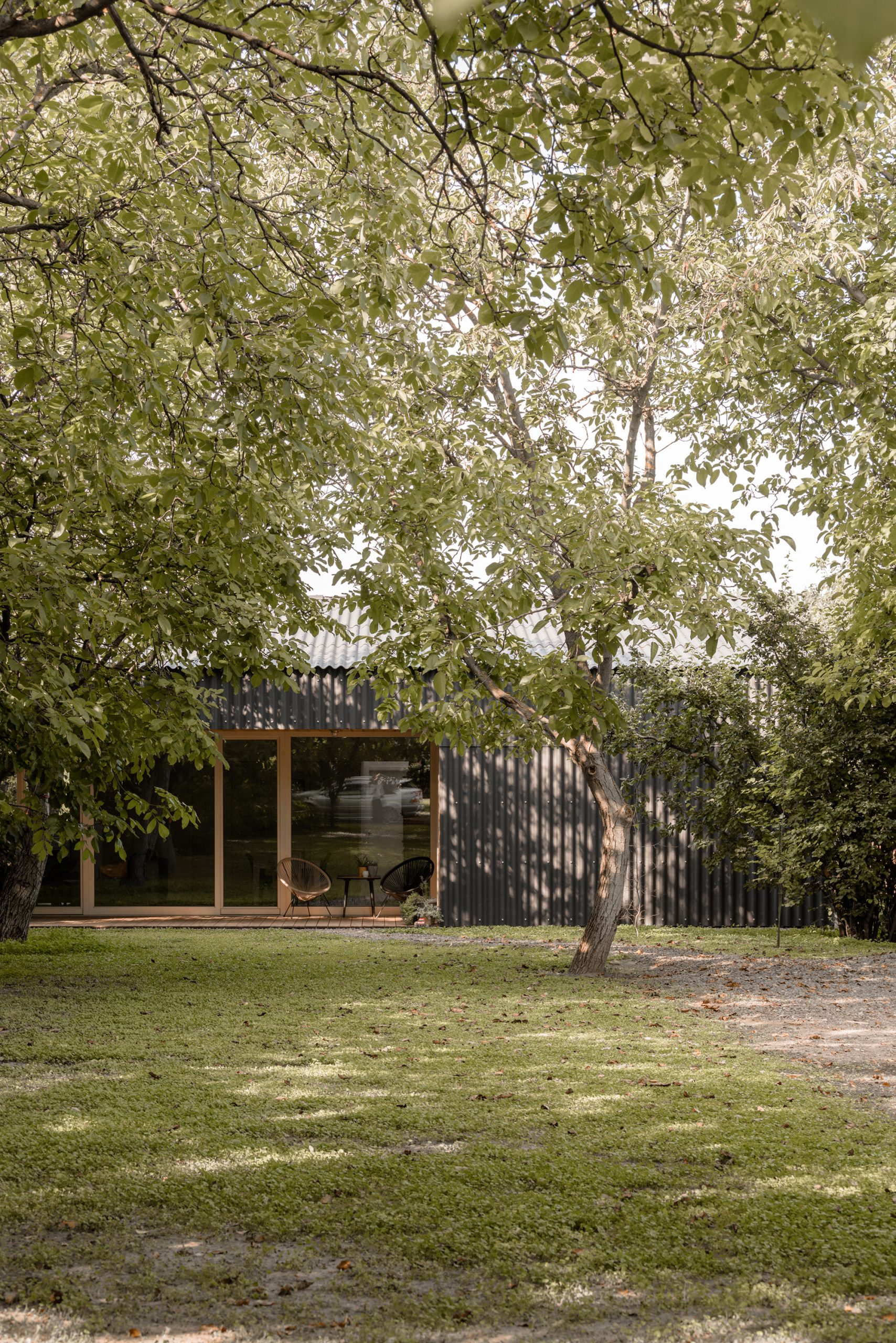
Our clients wanted to build their new home on the main street of Üllő, on a plot of land that had been in the family for generations. At the front of the long plot there was already a single-storey farmhouse with a cosy walnut grove behind it, perpendicular to the busy main road. Our building finally found its place in the area shared by the walnut trees and the field at the end of the garden, at the rear boundary of the property. At the moment, we can reach it by land with a handle in the usual way, but if the new road included in later town plans is built at the end of the garden, the approach to the house may be reversed – this was a crucial consideration when the building was erected and the entrance was determined. From the bedrooms to the north, the view is of a seemingly endless field, where deer and rabbits are not infrequent guests, and the south-facing sitting room opens onto the double row of walnut trees. The main road is not far away, but the peace is infinite. You might not even miss the new street.
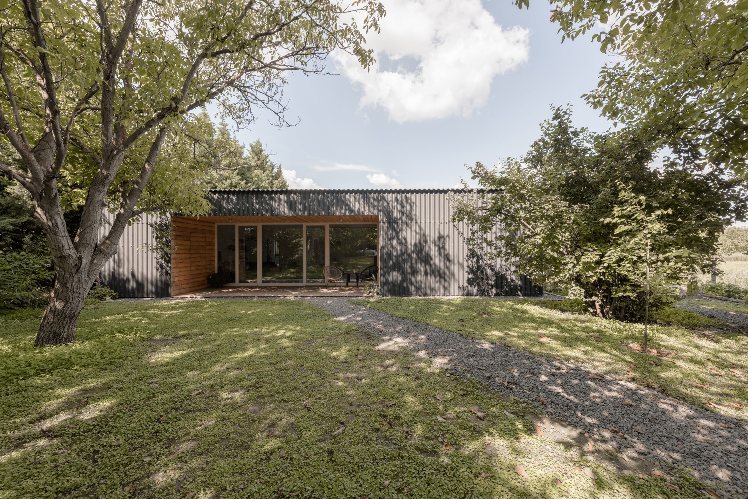
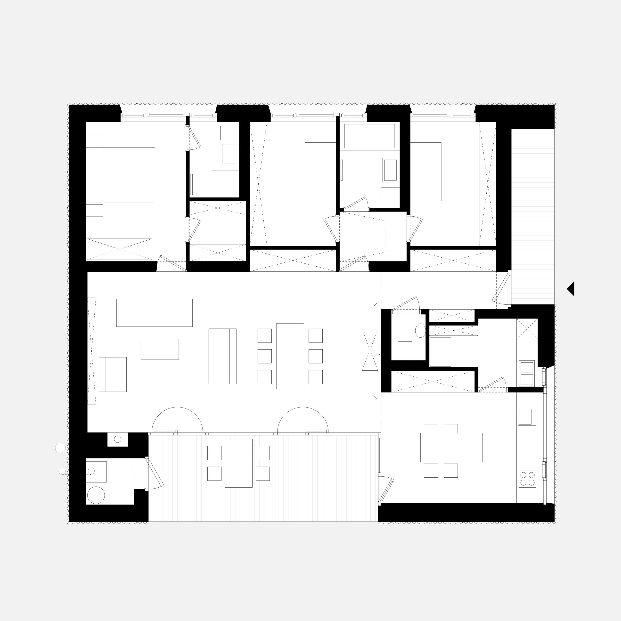
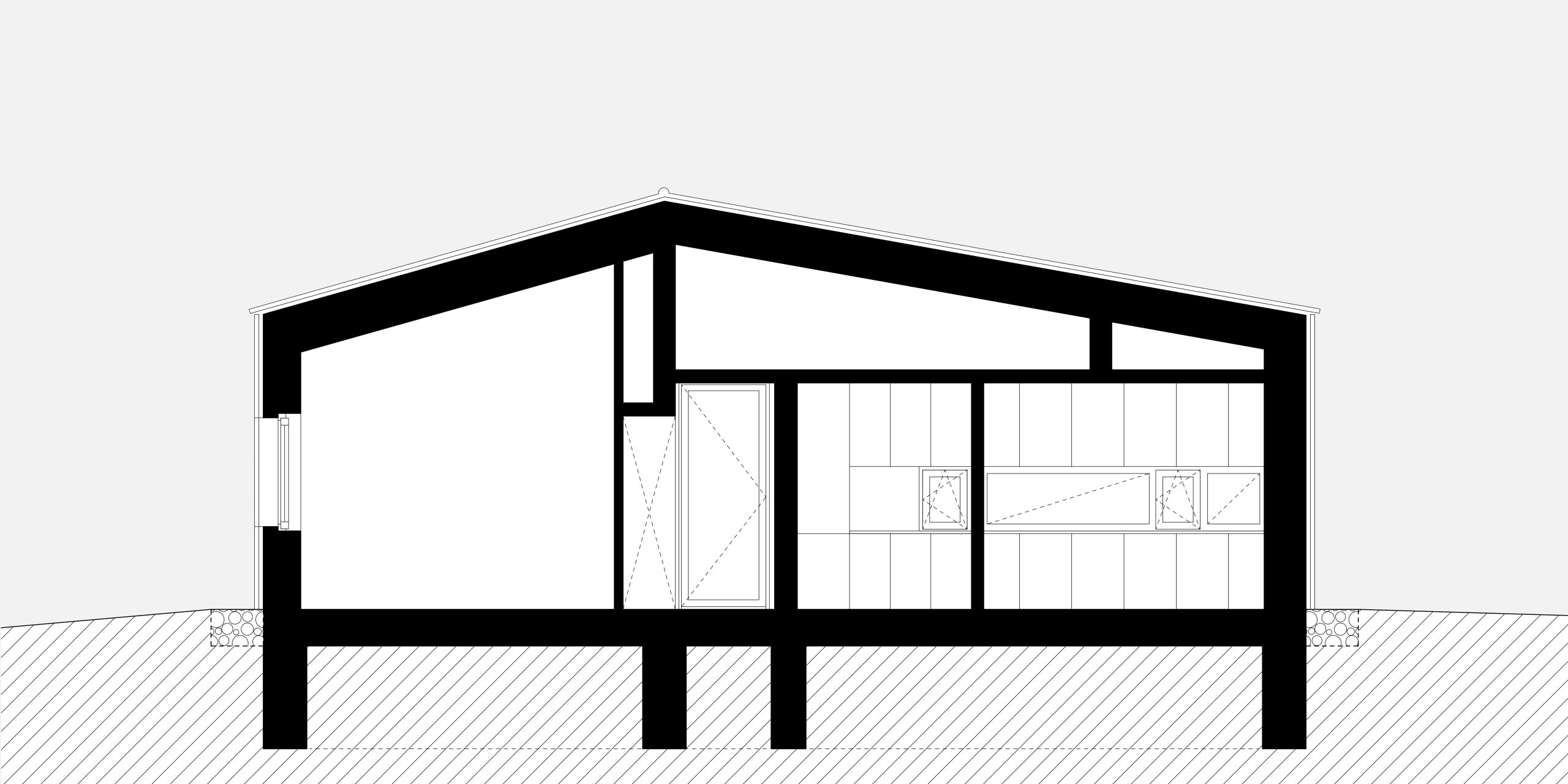
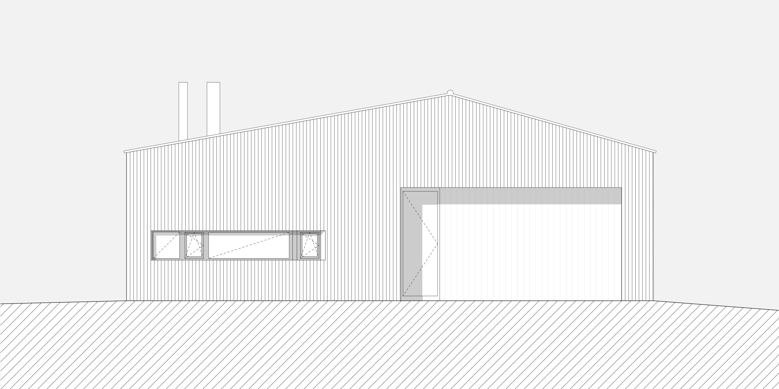
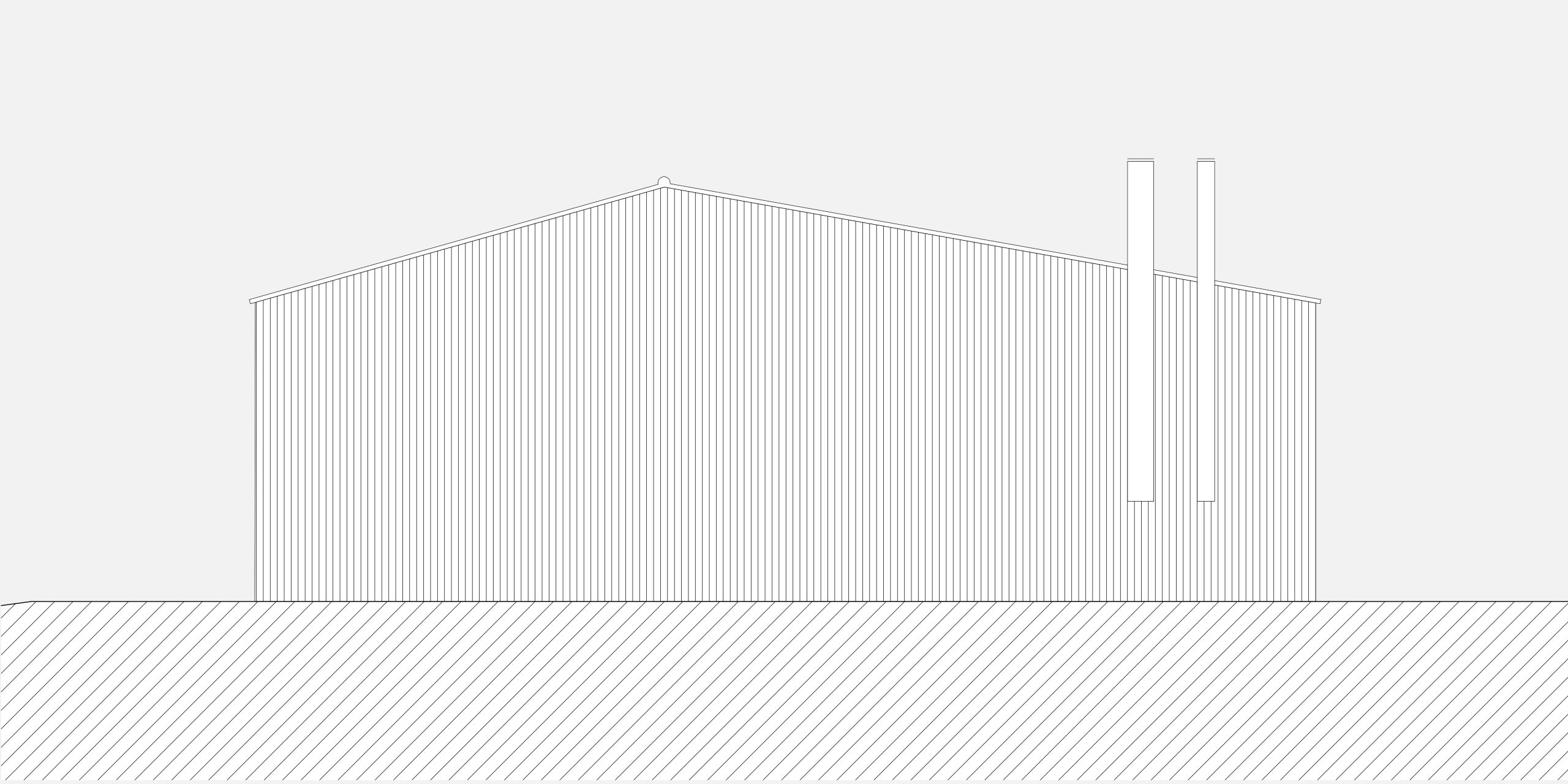
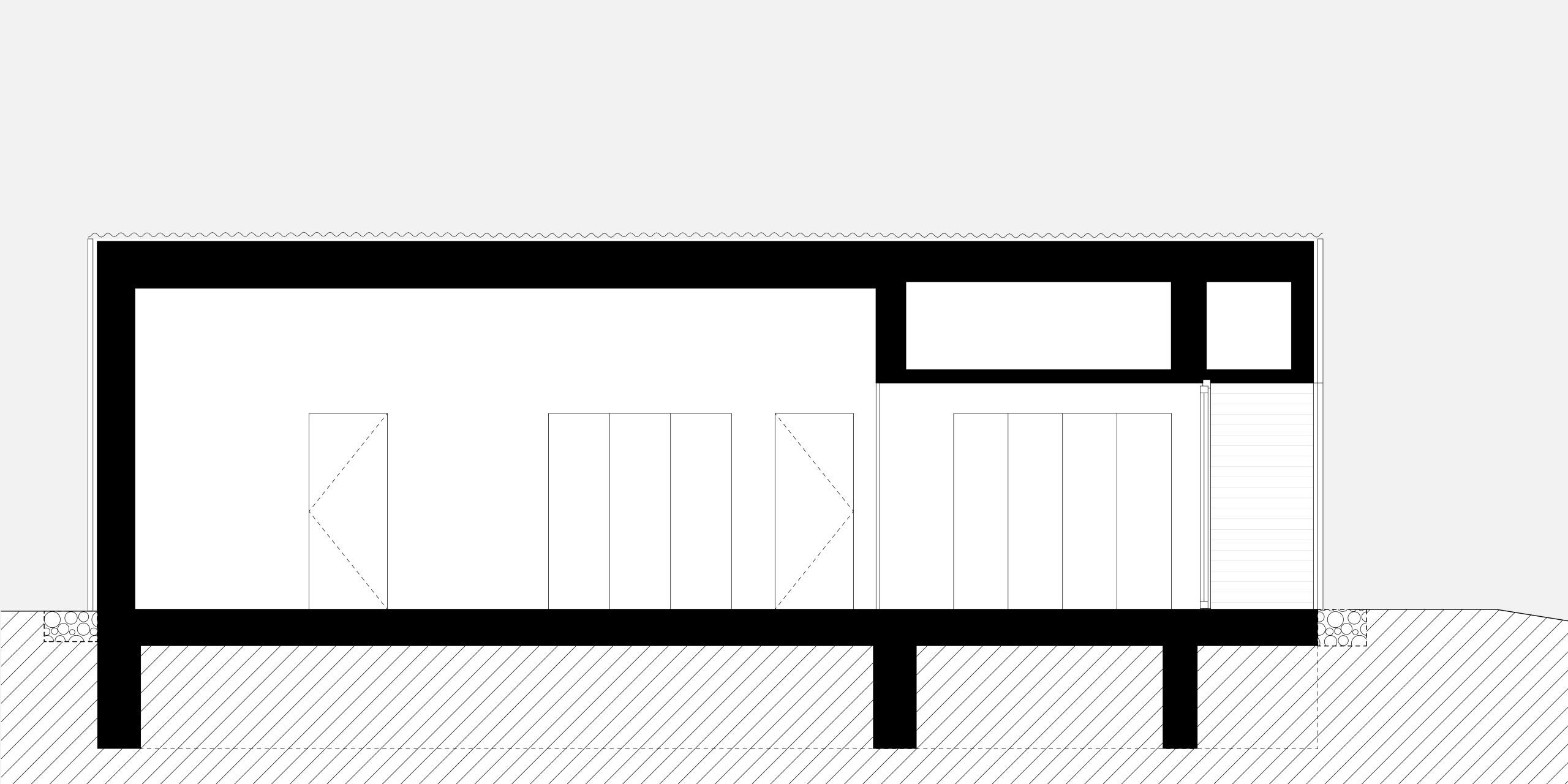
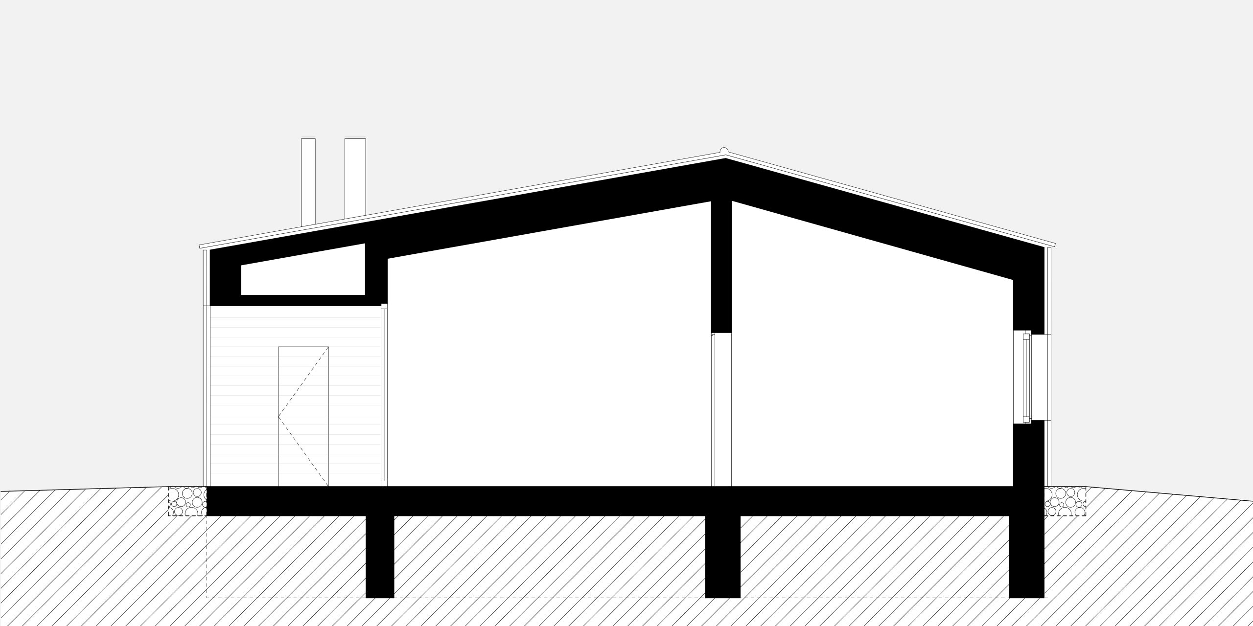
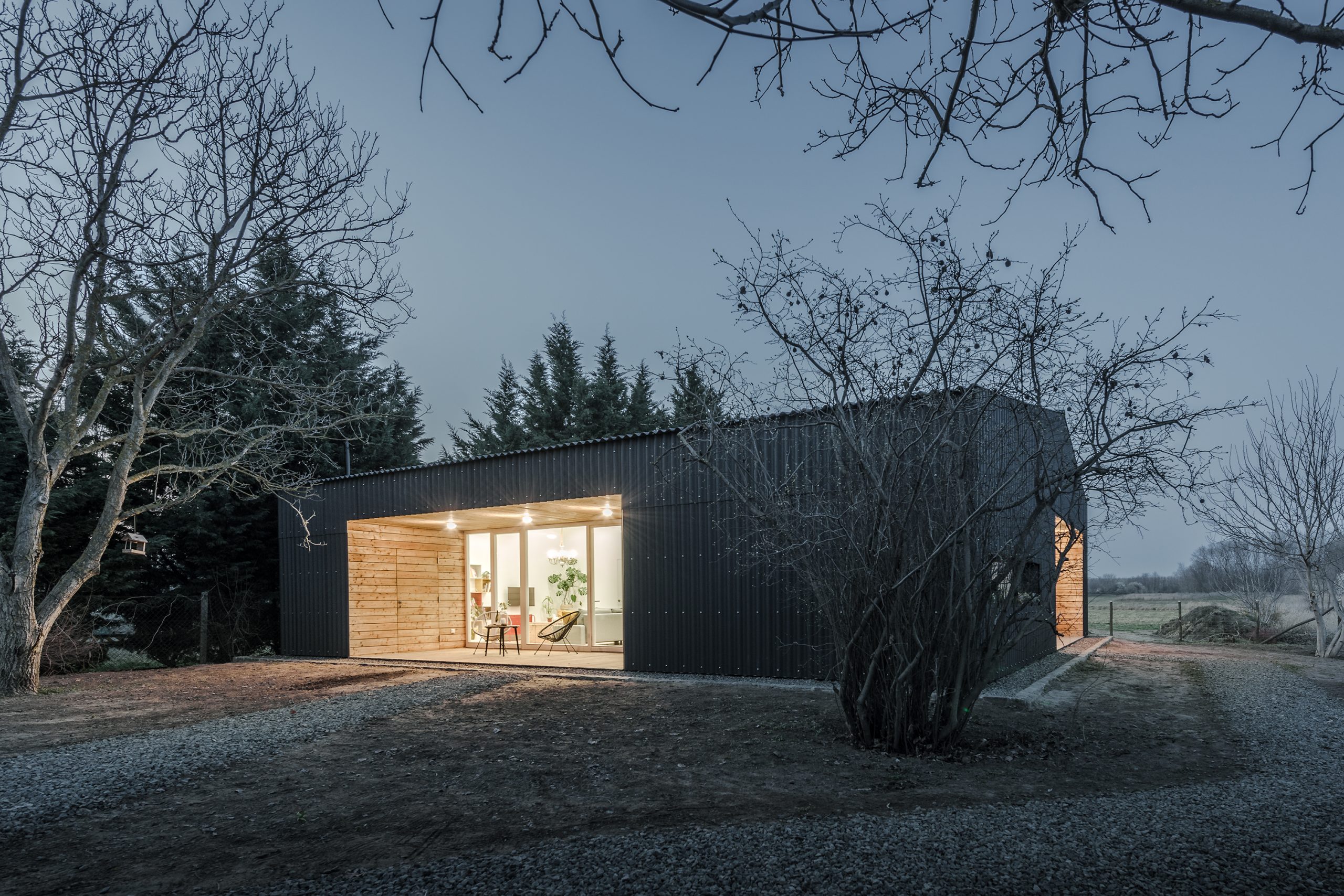
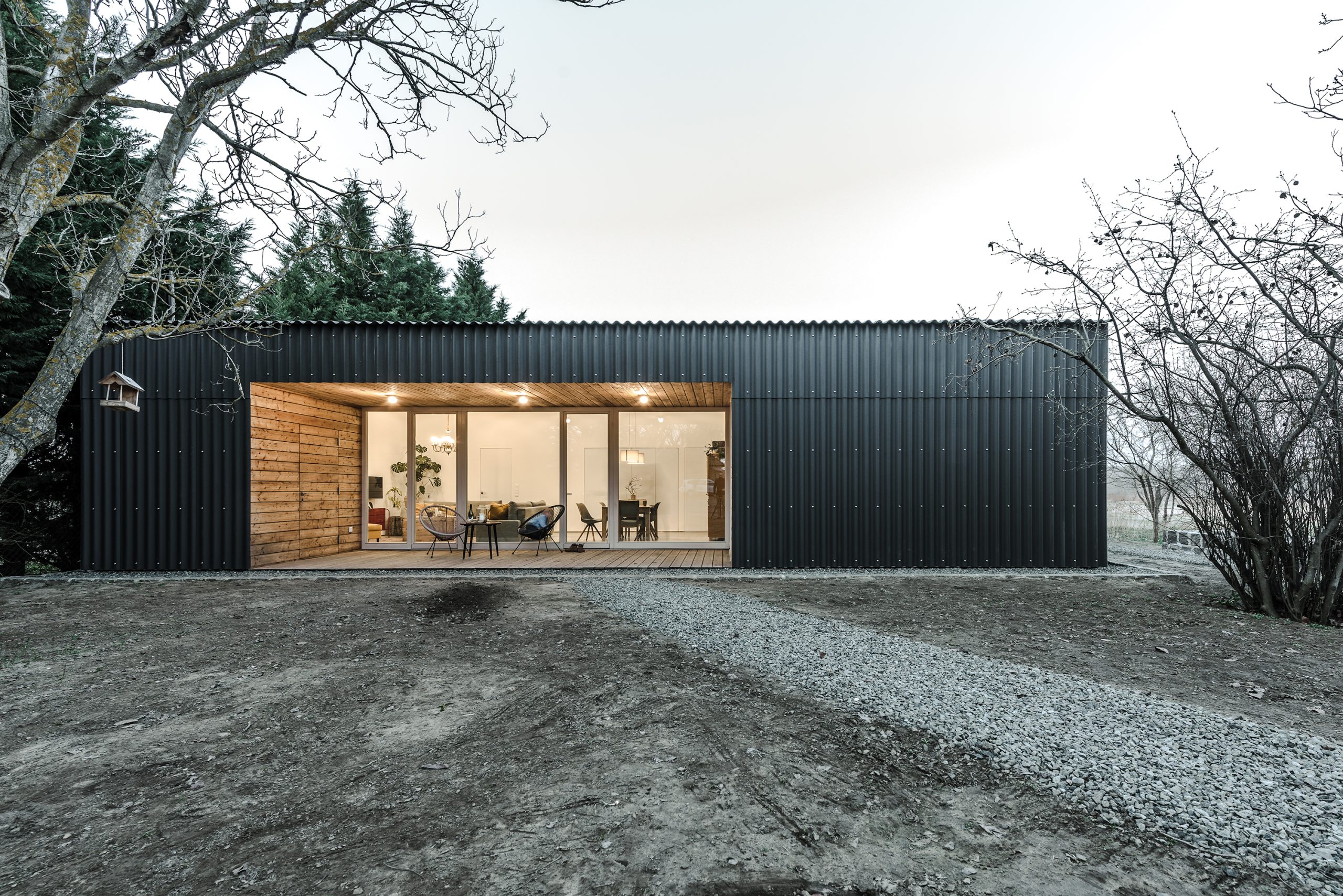
The massing was generated by creating a reasonable and habitable minimum of space. With a compact, square floor plan divided into two parts, it was possible to accommodate all the necessary functions in 110 m2. The half-timbered roof has a low pitch and its asymmetry follows the space requirements of the rooms. The formula is completed by two transitional spaces: the shelter of the entrance and the terrace in front of the living room, and the southern shading of the façade are ensured by the incisions made in the closed mass.
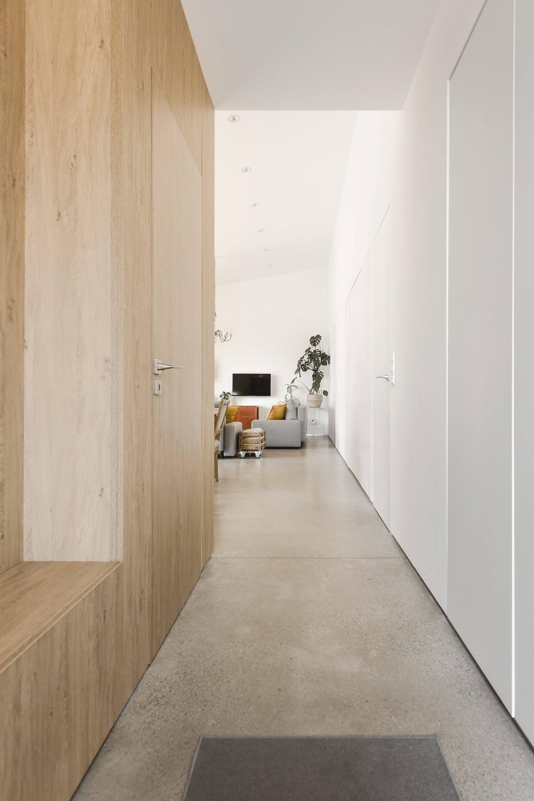
To the north are the three bedrooms and the adjoining bathrooms, and to the south the kitchen – dining room – living room. We enter the house at the division between the two sections. A strip of built-in cupboards separates the living room from the private area. The wardrobe opens in one direction and then in another, incorporating the frameless doors that lead to the rooms. The children’s rooms later will have a gallery above the wardrobes.
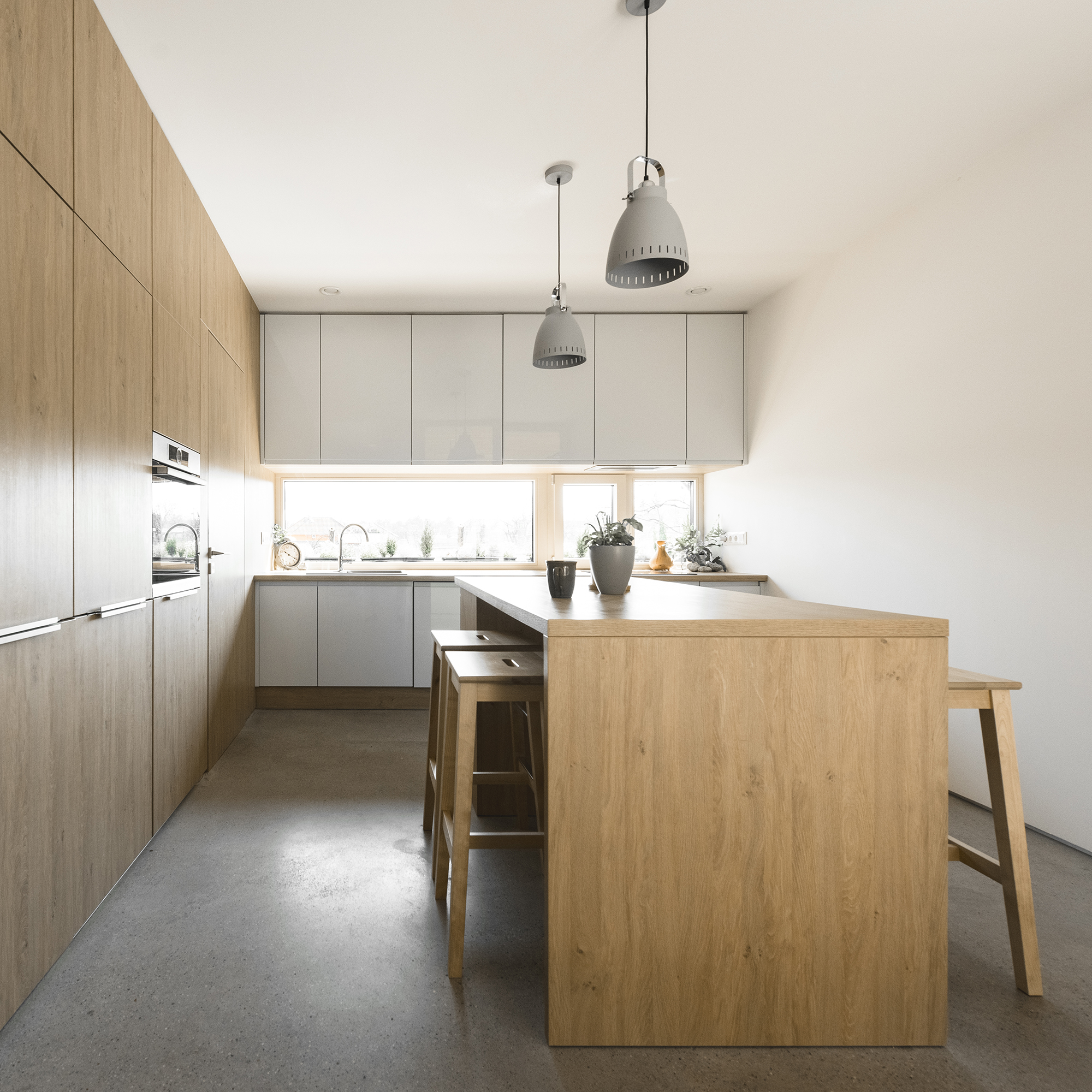
The kitchen – living room – dining room trio forms a single space. To suit the family’s needs, the kitchen is not visible on arrival and can be separated from the living room. The utility room, which opens from the kitchen, and the guest bathroom, which opens from the hall, are hidden in a wooden box between the kitchen and the hall. The wood panelling conceals a sliding door that can be used to separate the kitchen from the lounge.
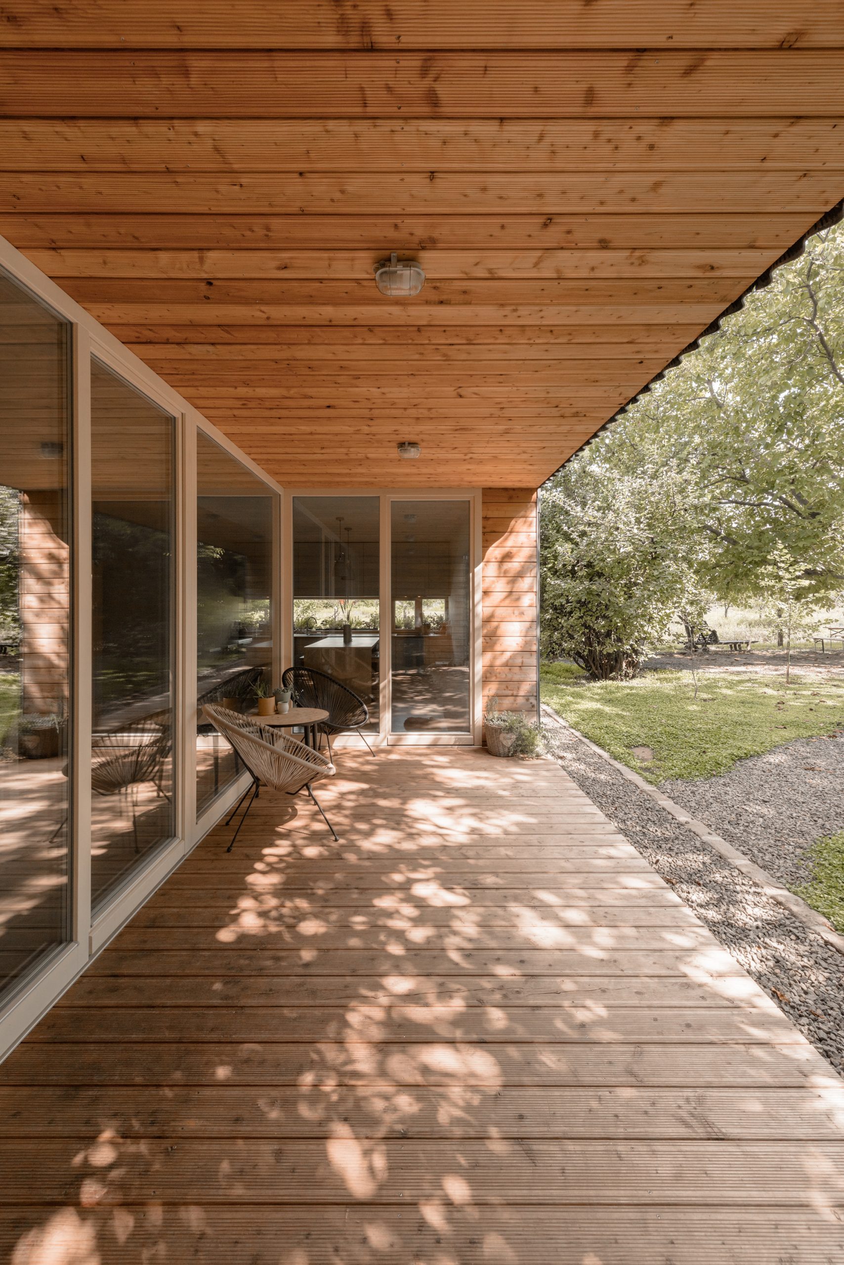
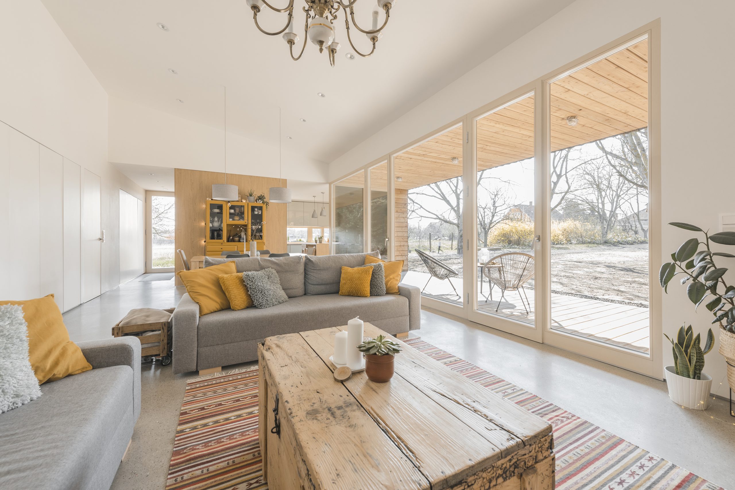
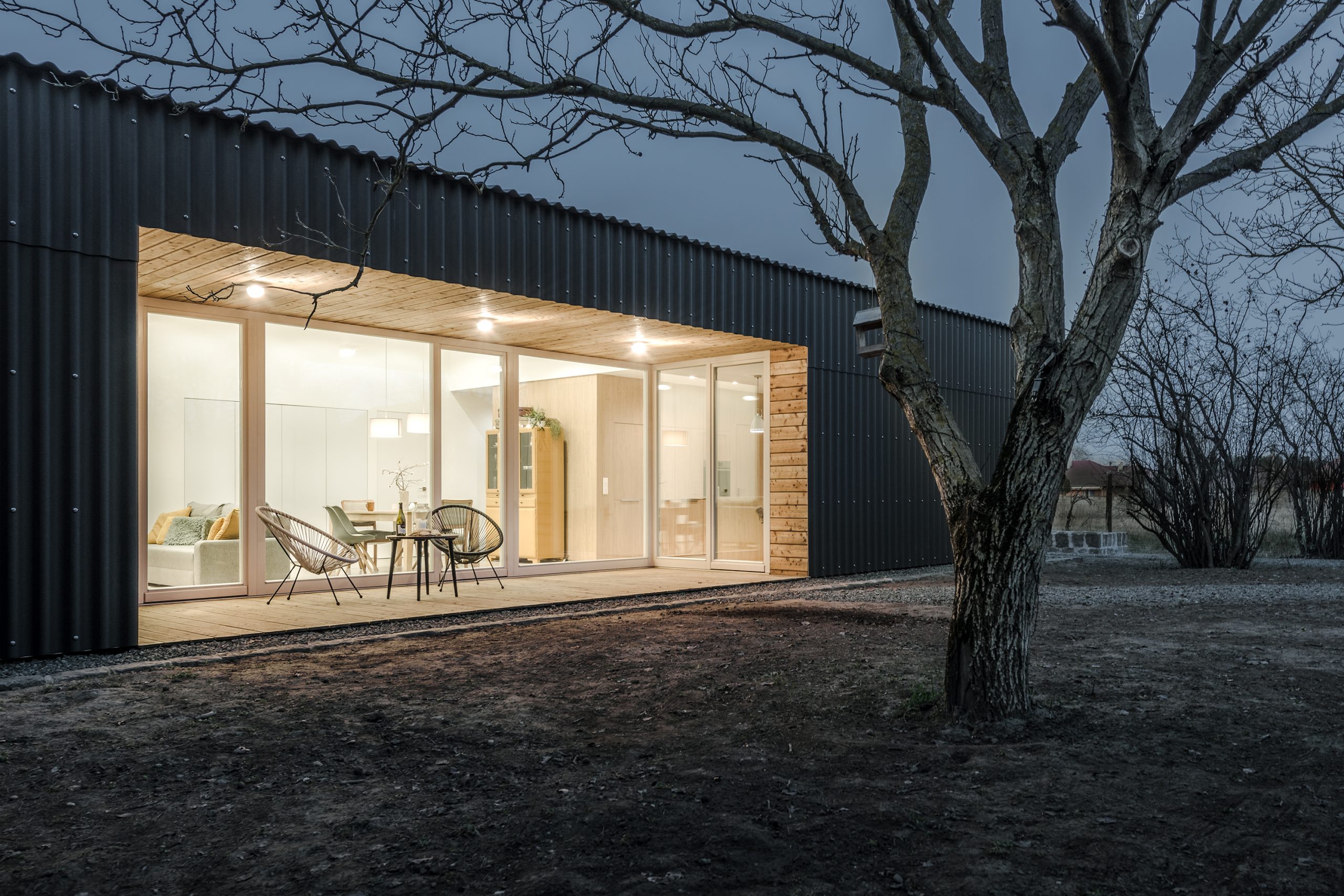
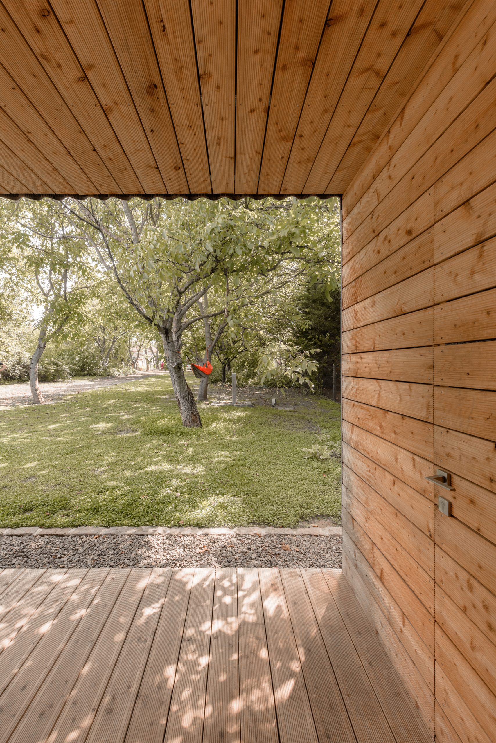
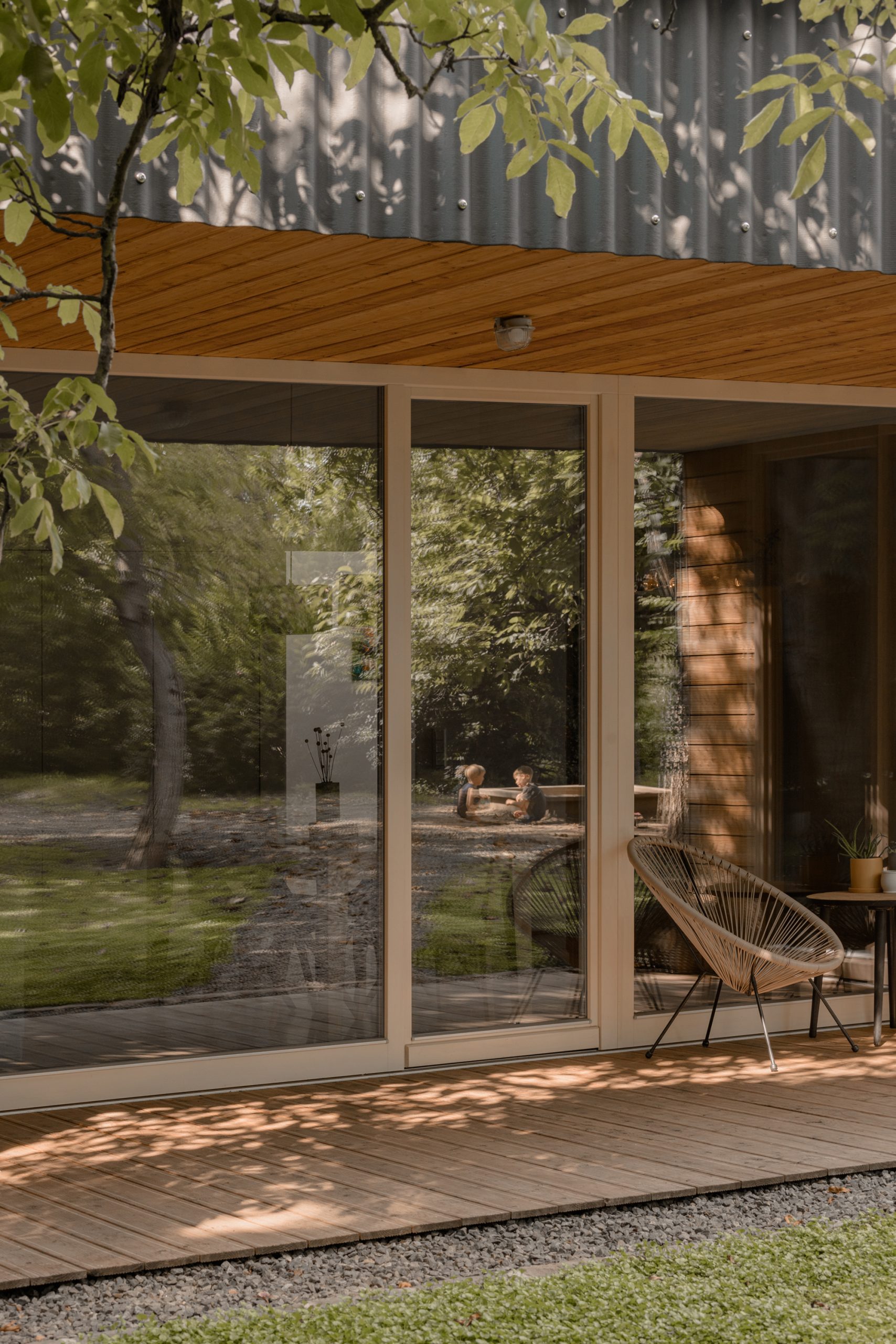
The covered terrace, which is closed on three sides, provides an ideal transition between inside and outside and opens up the entire length of the living/dining room to the walnut grove between the old and new houses. The kitchen has also been positioned so that it has a direct link to the covered terrace, reinforcing its outdoor living-dining function. A similar transitional space is the covered vestibule in front of the entrance, which radiates a sense of homeliness to visitors. Every square centimetre has a function, so the thicker part of the terrace on the side garden provides space for the mechanical room.
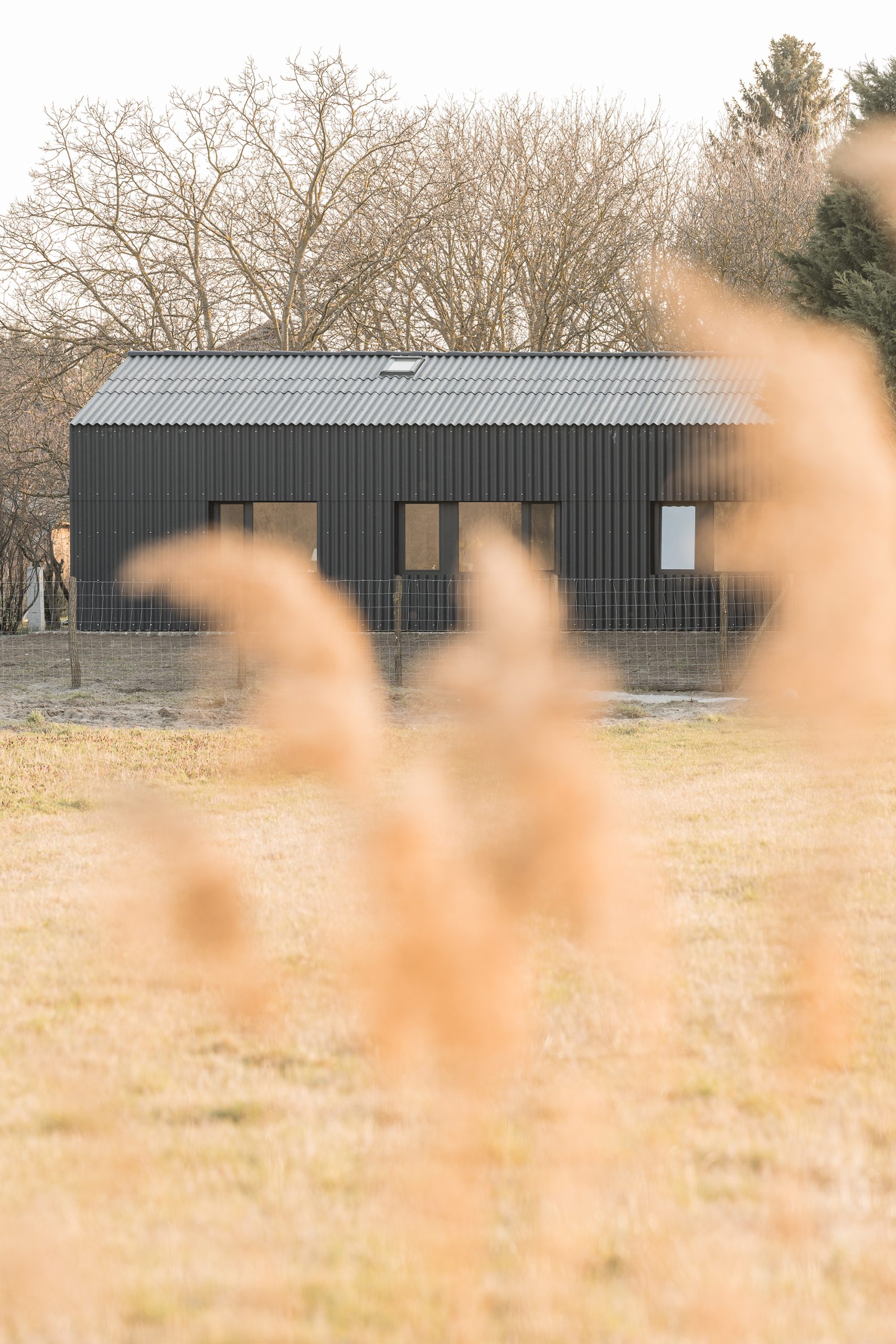
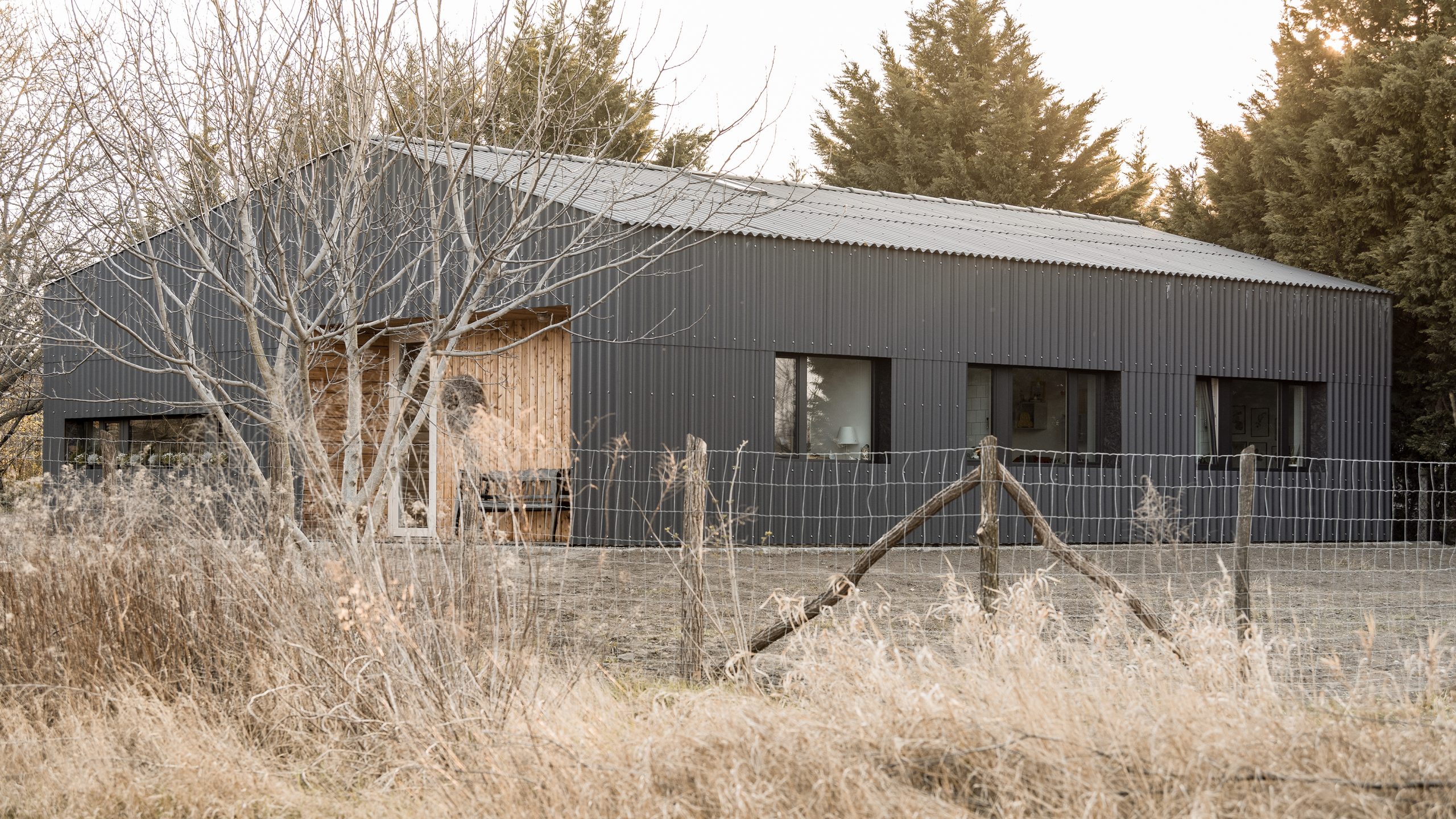
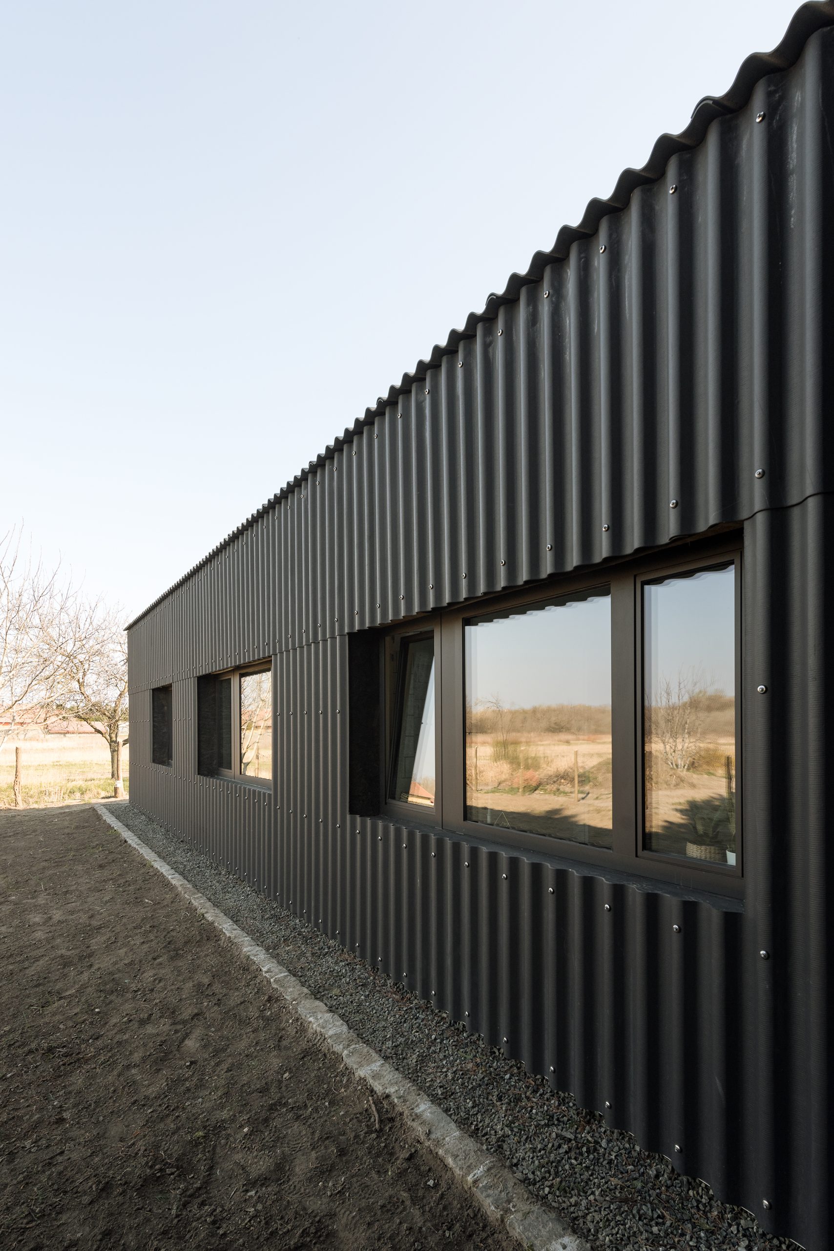
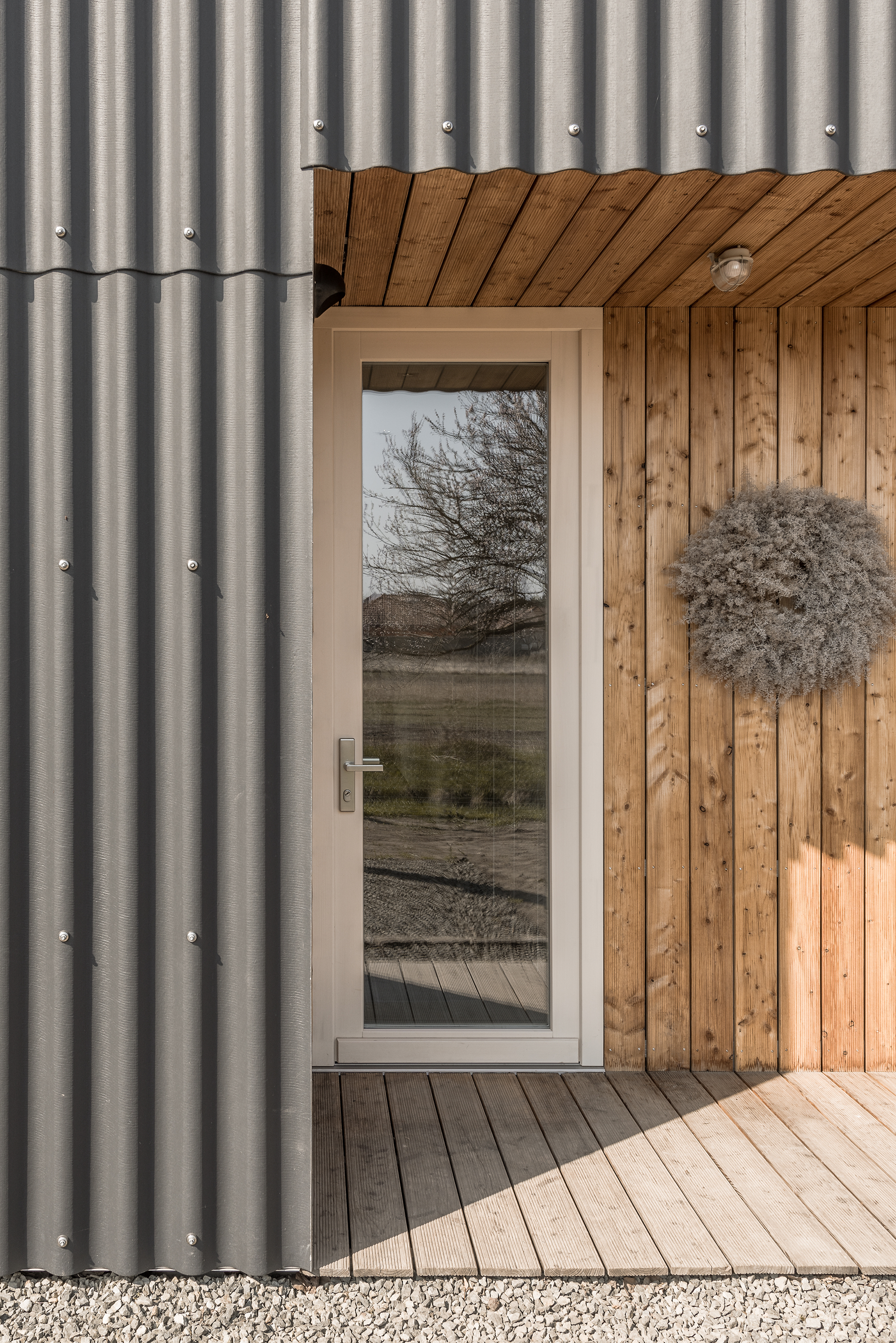
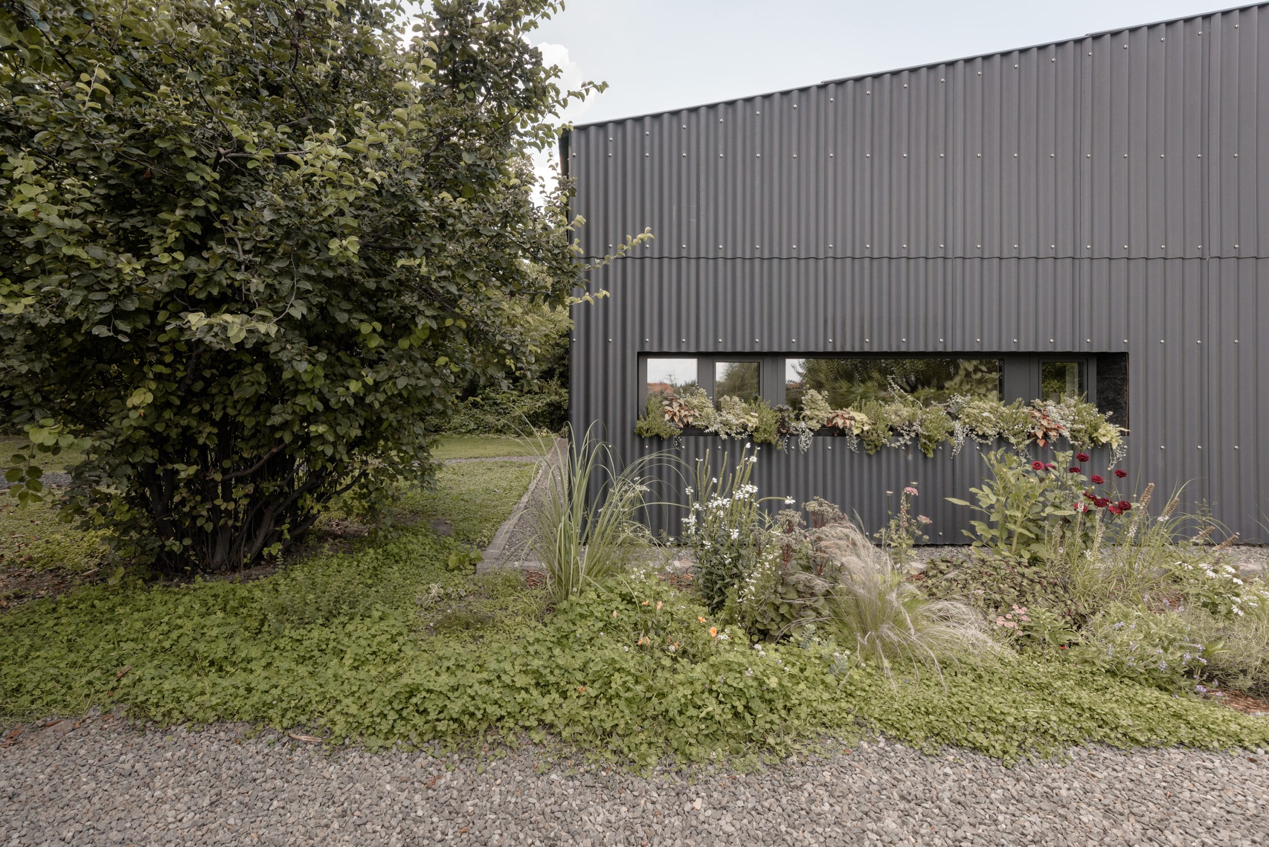
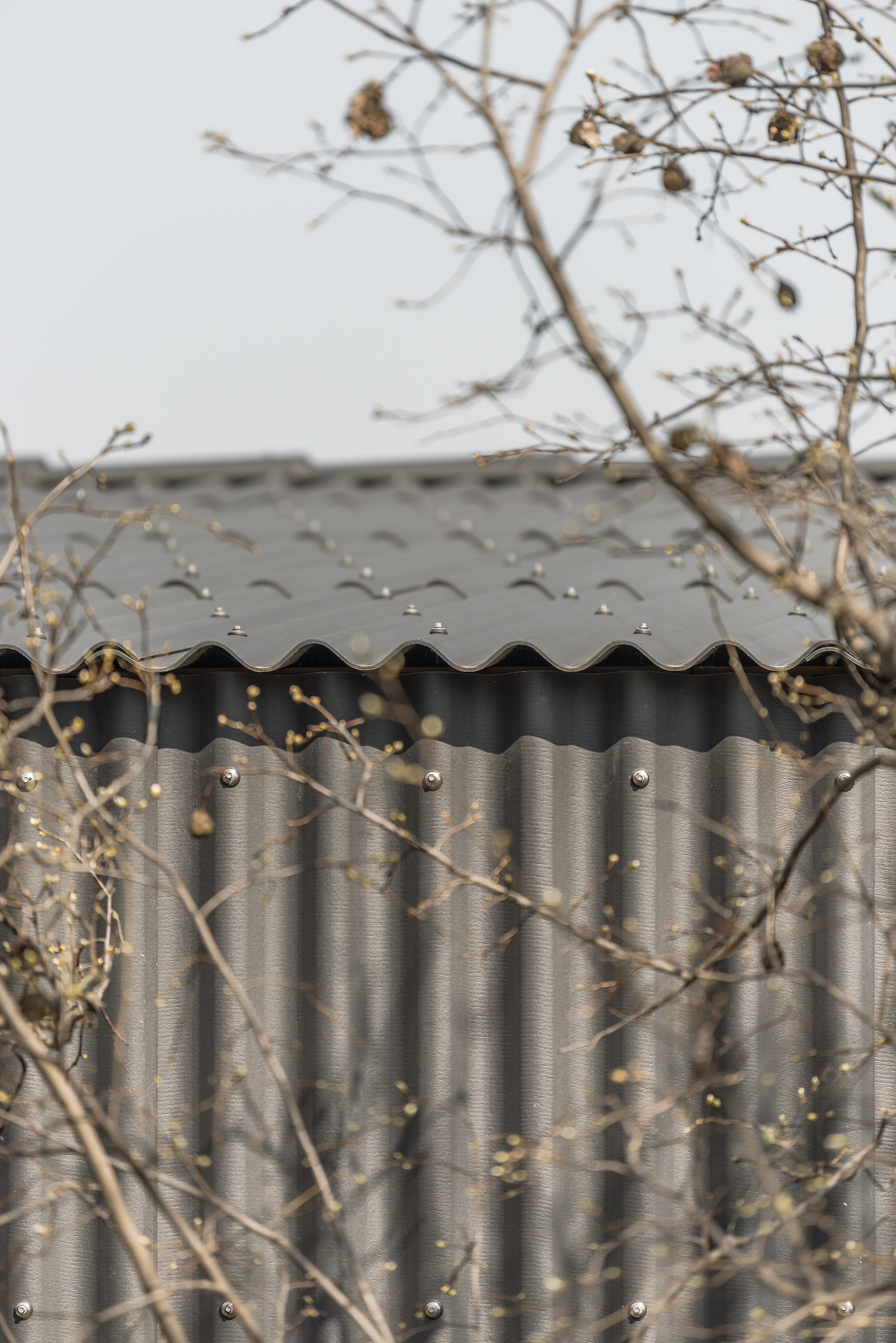
For the façade and roof, we wanted a material that would create a homogeneous, protective envelope around the broad mass and the matching low-sloping, asymmetrical roof. We introduced the economical, durable, modern corrugated slate which, unlike its notorious predecessor with a similar appearance, is a safe building material free of harmful substances.
It is important that a family home like this responds to and blends in with its surroundings. That’s why we chose black cladding, because in our case the site is hidden away from the archetypal red-roofed, whitewashed houses lining the main road, in the zone of commercial buildings, in the shade of the walnut trees. So we tried to adapt to the shady, leafy and woody environment.
Much to our surprise and delight, customers quickly fell in love with the idea. From then on, exploiting the potential of fibre cement corrugated panels became a stated goal. Its modularity and assemblability allow for a DIY yet precise construction, and even when disassembled, possible future infrastructure developments can be installed underneath the shell. We also optimised the details for the material. The eaves could also be excluded due to the waterproof and geometric properties of the corrugated sheeting. Around the building – designed by the head of the civil engineering family – a seepage system, hidden in a gravel bed, takes care of rainwater drainage.
The entrances and exits are set back, away from the water dripping from the roof. With a few years’ experience, we can already see that the house is passing the test well. The black corrugated slate that surrounds the entire mass acts as a perfect covering, and its self-cleaning, industrial character is offset by the warm colour of the raw larch cladding of the negative “bites”.
Beneath the ventilated black shell, the supporting structure is made of 20 cm thick sand-lime brickwork with 20 cm of mineral fibre thermal insulation, and the roof structure is traditional carpentry, also with mineral fibre thermal insulation. In the summer, the dark surface heats up quickly and the ventilation behind the envelope is quickly activated, playing an important role in the external cooling of the house.
Throughout the design process, our aim was to create a practical home for a family of four, a proportionate, rational, compact house without frills, but not without kindness. While the design is skilful but simple, the use of materials is bold and unusual. The owners and partly the builders of the house – a young couple with two small children – dreamed of a simple, practical, ground-floor house with low initial costs.
They proved to be ideal clients – perhaps because the head of the family works in a related profession, civil engineering – they were open to bolder ideas and a real dialogue developed during the planning process. As a result, decisions were always emotional but rational.
In designing the interiors, we aimed for a simple, clean and homely design. The clients had a clear idea of a polished concrete floor in the living areas. This homogeneous flooring reinforces the continuous spaces, while the parquet flooring gives the rooms a warm atmosphere. The walls have been painted white throughout, and the bathroom walls are tiled in simple white tiles.
In the clean spaces, the old family pieces have a great effect: the antique yellow-painted sideboard, the bench inherited from the grandparents by the entrance, the wardrobe that defines the atmosphere of the parents’ bedroom, or the old travel chest that functions as a coffee table. These pieces have already found their place in the design. Working closely with the clients, we have succeeded in creating a forward thinking, rationally designed, ecologically compact home that is also very lovable, exciting, flexible to use and sustainable in the long term. We were delighted to receive the Green House of the Year Award and the Media Architecture Award.
| architecture: | Csaba Balogh, Ágnes Deigner, Levente Sirokai, Péter Sónicz |
| Orsolya Tatár-Gönczi | |
| structural engineering: | Balázs Magai | Hidrokomplex Mérnökszolgálati Kft. |
| mechanical engineering: | Attila Lucz | HVArC Mérnöki Iroda Kft. |
| electrical engineering: | Judit Balázs | Artvill Mérnökiroda Kft. |
| photography: | Krisztina Ancza, Levente Sirokai |
| publication: | 2021 | contemporist |
| 2021 | Archdaily | |
| 2021 | designboom | |
| 2021 | OCTOGON | |
| 2020 | epiteszforum.hu | |
| 2024 | DWELL | |
| 2024 | Archello |
| awards: | 2020 | House of the Year – Green House of the Year |
| 2020 | Media Architecture Award – main prize |

